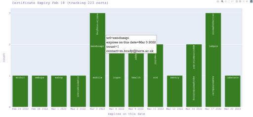
It’s particular to our site really as it requires the maintenance of a json file.
So each host has a json document in an array just keeping track of the url, port and daystogo. So as its coming up for renewal, you can see the week ahead.
[
    {
        "daystogo": 201,
        "url": "aardvark.example.com",
        "contact": "me@example.com",
        "port": "443",
        "expiry_date": "Oct 21 23:59:59 2022 GMT"
    }
]
df = pd.DataFrame(display_these)
  fig = px.bar(display_these[0:10], x='expiry_date',   barmode='stack',  color='url', text='url',
                custom_data=['url', 'daystogo', 'port', 'expiry_date', 'contact', 'grade', 'full_expiry_date', 'full_url']
                 )
  fig.update_traces(
    hovertemplate="<br>".join([
        "%{customdata[7]}",
        "daystogo(%{customdata[1]}), port(%{customdata[2]})",
        "expires (%{customdata[6]} )",
        "grade(%{customdata[5]}), email(%{customdata[4]})",
    ]))
  fig.update_layout(
    yaxis = dict(
          tickmode = 'linear',
          tick0 = 1,
          dtick = 1
     )
  )
  today = date.today()
  MonthDay=today.strftime("%d %b")

  fig.update_layout(
      title_font_family="Times New Roman",
      title_font_size=25,
      font=dict(
          size=14,
          color="Black"
       )
  )
fig.update_layout(
      hoverlabel=dict(
          bgcolor="lavender",
          bordercolor="gray",
          font_color="gray",
          font_size=18,
          font_family="Times New Roman"
      )
  )
  fig.update_layout(title = '(' +  MonthDay  + ") - The Next 10 Expiring Certs" , showlegend=False )
  fig.update_traces(marker_color='orange')
  fig.update_layout(modebar_remove="zoomin,zoomout,pan,lasso",plot_bgcolor="lavender")